
My first typeface!
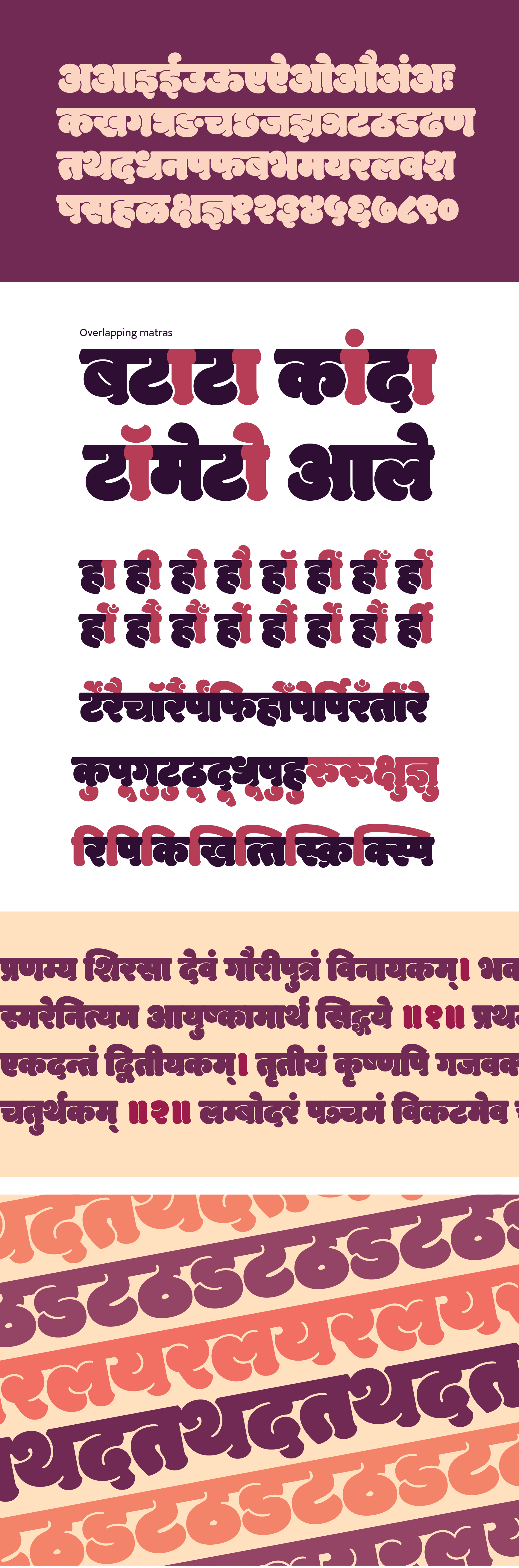
Back in February 2013, I joined Ek Type Foundry, Mumbai to improve my calligraphy skills and dive into type design. This project was given to me by Sarang Kulkarni. It was his experimental type exploration, where he wanted to test the unexplored possibility of very heavy yet legible letterforms in Devanagari. Later, what emerged were plump characters whose curves merged into each other, forming distinct counter-shapes.
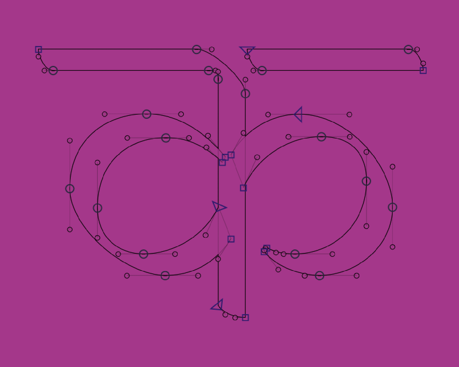
This project will always remain close to my heart. It took us a whole year to figure out and complete this typeface. Another special thing about this project was that I learnt and wrote the open-type feature codes for this font. Modak has more than 200 overlapping vowel signs that are personalised for each letter and conjunct. Every conjunct is drawn as a single entity. These vowel signs and conjuncts are the features unique to Modak.
Modak was loved by the type and graphic design communities for its uniqueness. It is indeed one of its kind and probably the chubbiest Devanagari typeface to ever be designed!
This project was led by Ek Type. Modak Devanagari is designed by Sarang Kulkarni and Maithili Shingre and Modak Latin by Noopur Datye. It is available to download on Google fonts.