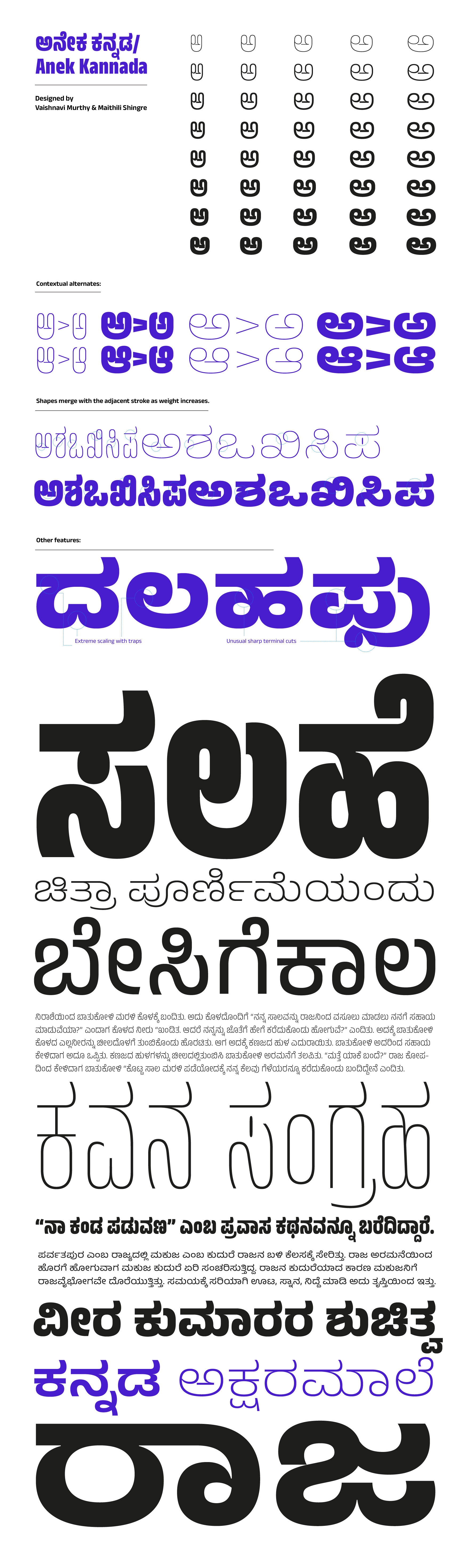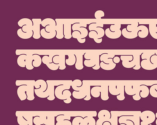

Anek, as the meaning of the word suggests, is an exercise in multiplicity — multiple scripts designed in multiple weights and widths by multiple designers. Embracing the variable font technology, Anek meets the demands of the modern multiscript page with its confident and contemporary design. Its expansive design space allows Anek to don multiple personalities. At its most condensed, capsular forms keep structures compact for that graphic texture.
On the wide end of the spectrum, the extra legroom lets each letter yawn and stretch into their message. But it is in the boldest weights that Anek comes alive. Sharp terminals and tapered joineries sparkle amidst regimented forms, making this ideal for setting titillating headlines or that magnetic word-mark.
While the extreme styles wear their style on their sleeve, the middling widths and weights mean business. When in the presence of other styles, they recede into the back, allowing the extremes to shine. But left on their own, they set text with a quiet confidence. The quirks are but a faint echo that no longer distract; clarity over personality.
I co-designed Anek Kannada with Vaishnavi Murthy.
Anek is a project led by Ek Type, and is available on Google Fonts.